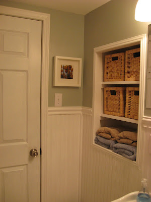


We actually finished this bathroom a few weeks ago, but we just got around to finally taking some photos. We are SO pleased with the way it turned out. Adding the window made a dramatic difference in the effort to make it not feel like the basement. Here's the finished product:


The grout color on this tile is a little lighter than the upstairs bathroom, and I like it a whole lot! Okay, so who wants to come stay with us?


10 comments:
O my goodness!! Gorgeous! I love the white railing on the side and the colors you guys chose... love it! Really fresh :D Job well done, JJ and Dave!!
Beadboard is fabulous stuff and I like the color paint you went with. The little cubby with the baskets, was that there before or did you guys do that? It looks really good!
IT turned out great! I love the baskets, it makes it feel cozy. good job!
It looks so inviting! I love the window! Can't wait to visit you and David (and Baby Jave) in December!
We put in the shelving and the baskets. It's great to have a little bit of storage in there.
It is beautifully done...so warm and inviting!!
yay for more storage space. :)
Wow! That's looks awesome! Such a transformation :)
WOW! What an incredibly beautiful transformation!! Maybe you should go into business "flipping" houses! You two are so creative and resourceful. Awesome job!
I do! It looks amazing JJ!
I'm in love with the wainscoating! SO beautiful!
Post a Comment